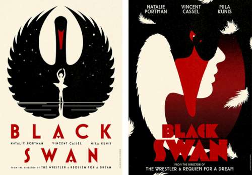
Amazing work, vintage tasty. I didn't watch Aronofsky's movie yet, - but this set kind teases me to. More than the original poster (my apologies, Natalina).
"If only actors, agents, and studios would let go of their inane photographic (star's head must occupy 50% of poster) and typographic (star's name must appear before all other names and be X inches high) requirements, we would see more posters like these distinctive campaigns that are true to the films they represent." [Stephen Coles] - Totally agree with that. Remake by La Boca, buy here.
![]()
"If only actors, agents, and studios would let go of their inane photographic (star's head must occupy 50% of poster) and typographic (star's name must appear before all other names and be X inches high) requirements, we would see more posters like these distinctive campaigns that are true to the films they represent." [Stephen Coles] - Totally agree with that. Remake by La Boca, buy here.
Feedback:
not yet, probably nobody cares, or nobody cared enough to tell something. Also: nobody reads komakino.
Leave a feedback about this post, or don't.
your sweet name:
your IMPORTANT text:
url:
icon: will be resized 30x30pxl
your IMPORTANT text:
url:
icon: will be resized 30x30pxl


 ·
· 





.jpg)







 see blah blah archives


