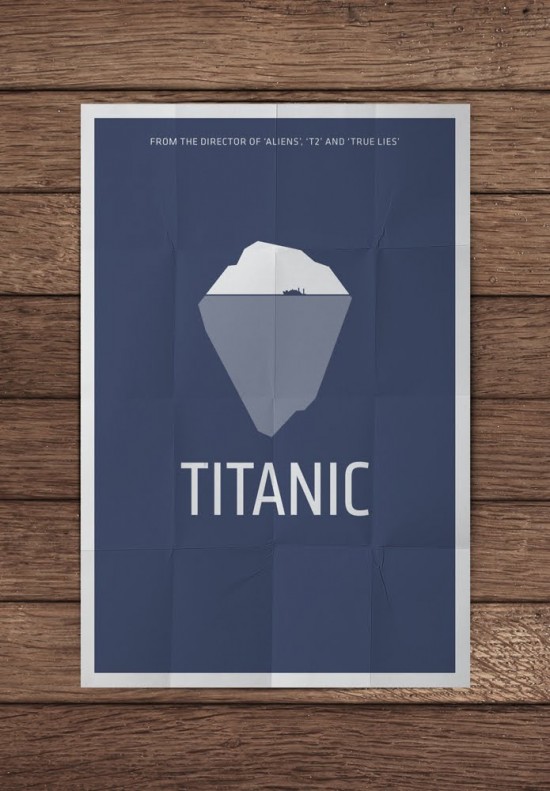
It is a couple of weeks I see here and there in internet these film posters remakes by Pedro Vidotto, a gifted illustrator from Brazil, - so, You probably already saw them too, - and this thing of minimally-re-thinking classic titles' posters is not that novelty under the burning Sun, - okay, - btw, these pieces are brilliant, - a very good style excercise, - in particular, I love this one for the Titanic. - There are like other 40 ideas, - enjoy a full panorama @ Fubiz.
Plus
in very last hours mr. Vidotto also ventured in making some literal poster, - below, a shining example.
![]()
Plus
in very last hours mr. Vidotto also ventured in making some literal poster, - below, a shining example.

Feedback:
not yet, probably nobody cares, or nobody cared enough to tell something. Also: nobody reads komakino.
Leave a feedback about this post, or don't.
your sweet name:
your IMPORTANT text:
url:
icon: will be resized 30x30pxl
your IMPORTANT text:
url:
icon: will be resized 30x30pxl


.jpg)

 see blah blah archives


